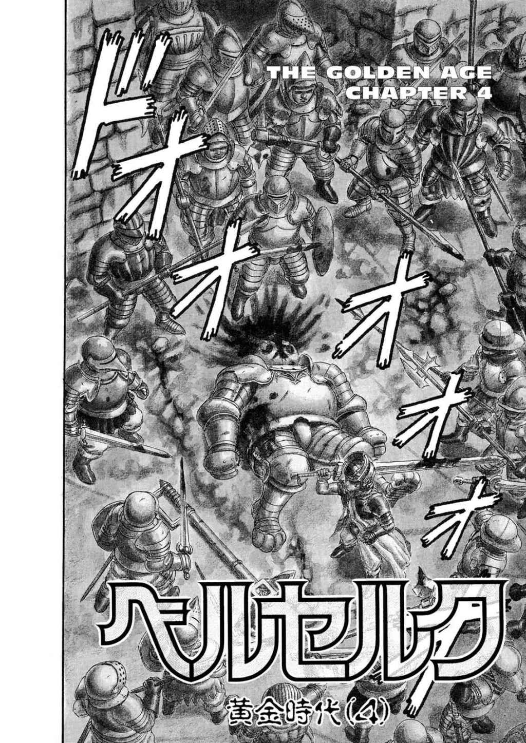
Berserk: The Golden Age Chapter 4 and Speed
Much of what is called magic, similar to technology, is really about the manipulation of time. It takes time to light a fire, chopping and building wood, finding kindling, and creating a spark. But a magic spell, or a propane stove, will accomplish the same thing much faster. I could take the time to learn how to swim, or, I could turn myself into a fish or use a boat. Much of the magic of comics is similarly about time manipulation.
By choosing what to draw and write, the wizards who make comics can control how fast a moment is perceived by a reader. They can traverse vast quantities of time and space between panels, or make what should be a brief moment in time take up an entire issue. They can even affect how long it takes to read a panel, often by inserting way too many words in caption boxes and dialog. For a masterful depiction of time manipulation in comics, I’ll be looking to Kentaro Miura’s Berserk, here translated by Jason DeAngelis with lettering and retouching by Dan Nakrosis. Specifically, all drawings are taken from Chapter 4 of the Golden Age storyline.

One of the easiest ways Miura illusively depicts speed in a static medium is by jumping from one moment in time to the next between panels. These moments can feel abrupt, like a so-called jump cut in a movie, where a stationary camera stitches together two moments in time. In this opening sequence, our hero Guts seems totally unprepared. A giant knight is coming towards him, already having readied his hammer. Guts, on the other hand, is resting his sword on his shoulder.
In reality there would be no way for him to outspeed the knight. But, without depicting Guts readying his sword, getting himself into position, and swinging his arms to attack, Miura cuts to the finale. Before we knew it, Guts has already stabbed the knight. All of the implied motion happens between panels. This gives Guts the illusion of lightning-fast reflexes.
On the opposite end, Miura can, through a single image, imply a large span of time passing. Here we have, after the battle, Guts walking alone. At the top right of the page, where a reader looks first in the right-to-left style of manga, begins a path heading leftward and down, towards the center of the page. I’ve marked it with the blue arrow. One might assume that this is the path Guts has been walking. But, that turns out not to be the case. That path, which might actually be a river, turns back and goes off the right side of the page.

The turning back leads the eye to Gut’s actual path, marked by a purple arrow. Guts, despite being small and not in a lot of detail, is recognizable by his giant sword. He, presumably, continues down the road to the bottom of the page, where his path then trails off. This I marked with a green arrow. By making the eye follow multiple roads before reaching Guts, and leading it towards where he will travel, Miura implies a great journey. This single moment in time could have been days or even weeks after the previous page, and the moments in the panels on the right could similarly happen later on Guts’s travels. All of that time is compressed into a single moment, one giant panel.

The first example showed how Miura can quickly jump between two moments in time, implying the speed Guts can move. He also does the inverse, slowing down a brief moment in time by including many panels. The first time this occurs is right before Griffith’s crew attacks Guts. When he thinks he hears something, Miura draws two panels of Guts standing still, listening. Then, there is an empty panel with only some Japanese characters, presumably a sound effect, followed by yet another panel of Guts standing still listening. It is only then that the source of his unease, a galloping horse, is shown. This entire sequence probably would only take a second or two if it was filmed in real time. Instead, like a slow-motion replay, Miura extends the sequence out.
He does this again towards the end of the chapter, when Guts is defeated by Griffith. Hundreds of pages into this series, it is rare for someone to be Guts’s equal, let alone superior. This sequence slows down the time of Gut’s loss, revealing him to be stabbed. By letting this moment play out in a series of panels and without any dialogue, the brief moment in time is given increased emphasis and weight. And, to cap it all off, the final panel has Guts saying what the art has already shown us. Griffith is quick.


A third technique, common especially to many manga, is the speed line. It’s one of those purely comic book conventions, like speech balloons, because it has no real-world referent. The wizards who draw have somehow collectively convinced our brains that what we are seeing when we see these lines on the page is movement. This example is pretty typical, with the lines representing where the horses came from. If you follow them, like I have done with the blue arrows, they all intersect at the vanishing point of the drawing. This enhances the feeling of movement as it gives the reader a sense as to where the riders were without ever actually drawing that.

This two panel sequence (read right to left, because it is manga) is incredibly subtle. You almost have to zoom in to the digital image to see what I am talking about. But, when you look closely, you will see a series of dots, or short lines, surrounding Guts’s hair in the panel on the right that disappear on the panel on the left. These itty bitty depict a small amount of movement. Guts is struggling to get up, but this is all that he can manage. Speed lines can thus also depict the intensity, or lack thereof, of movement.

Finally, this example will bleed a bit into the next section, but it will serve as a nice transition. Here, the swords themselves are given speed lines. Look closely. There isn’t even an actual outline of the swords’s edges. It’s all implication, carried out by varying the thickness of the speed line. It is obvious that the raider’s sword has not swung as far as Guts’s because his speed lines are much smaller. Speed lines can thus show different amounts of movement for different elements on the page.

I’m not sure there is a term for what I am about to describe, so if someone has one, please let me know in the comics. I am going to call them exposure lines, because they look like a photograph from a camera with a long exposure and a moving subject. Like the sword in the previous examples, here Miura draws individual elements of the page as in motion relative to the other objects. The knight’s three-pronged mace and arm are drawn with exposure lines, whereas his helmet maintains perfect clarity. He is presumably on horseback and thus moving himself. But, relatively, his helmet is almost stationary compared to his arm and weapon. This depiction of relative motion would make Einstein proud, and is rendered beautifully by Miura.
Miura draws exposure lines all throughout the battle, but this panel is another personal favorite. There’s almost an entire story told with this single panel. Guts’s face is stationary enough that his expression is entirely readable. The entire rest of his body, on the other hand, is in motion and at work. Caska, a pretty dominant fighter herself, is drawn mostly normally. However, she does have some exposure lines drawn over her armor. Looking at this, I can feel the clanging of the metal swords reverberating across her body. Exposure lines add a physicality to an otherwise frozen-in-time two dimensional image.


The last technique Miura uses to depict motion is by drawing multiple moments at once in a single panel. Many people repeat the wisdom that a comics panel can only depict one moment in time, but, as this example shows, that isn’t always true. The speed at which Guts is attacking Caska is shown by including the previous moments in his downward strike. This technique is often used in comics with Flash or other speedsters, among other things. It is very similar to the idea of the exposure line, as it calls to mind the effects of motion blur in photography or film. Guts, with his raw physicality, is depicted kind of chaotically.
By contrast, Griffith’s multiple moments in a panel are depicted incredibly cleanly. There are virtually no exposure lines or speed lines. This, while also showing just how fast Griffith is, has a different effect coming after Guts’s battles. While Guts is a force of nature and pure willpower, Griffith is more elegant. His motion is minimal and controlled, even as he is faster than Guts. By drawing his fighting style differently, Miura is characterizing Griffith in a specific way.

There are probably many more ways to depict speed and motion in comics. Every artist will approach the problem differently, and that’s what’s great about comics. Even after reading thousands of pages, a great magician can still trick your brain into seeing movement on the static page in new and surprising ways. Understanding how artists draw speed and movement is yet another step on your journey of Divining Comics.
Consider supporting this work at ko-fi.com/spikestonehand. There, you can leave a tip or buy Zine versions of these articles. Doing this helps keep the website going.

Leave a comment