
Sand Land 1 and Detail versus Simplicity
The Dr. Slump and Dragon Ball mangaka wrote a series that is now a hit anime and video game
Some of the great artists of comics make their career off of obsessive detail. The recently departed Kentaro Miura was known for the intricate linework in Berserk. On the other hand, some artists follow the path of pure minimal line. Alex Toth is a great example there. But, are these two styles necessarily exclusive? If someone wanted to utilize the strength of both simplicity and obsessive detail in comics, how would they go about doing that?
They could turn to few sources worse than recently departed mangaka Akira Toriyama. Creator of beloved series like Dr. Slump and Dragon Ball, Toriyama had a knack for both simplicity and specificity. But how did he use these techniques? Let’s examine the first issue of his later series Sand Land to learn more about how he knew when to pull back and when to go all out.
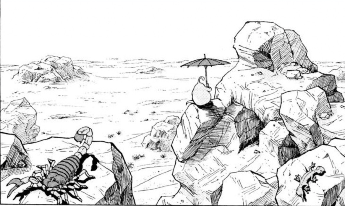
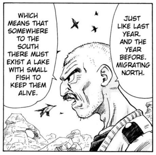
Let’s start, appropriately, by looking at the first panel on the first page. A technique often used in movies, Toriyama begins with a wide shot of the setting. This series takes place in a desolate, desert landscape, but that doesn’t mean things are empty. Every rock and craggy formation is rendered with detailed cross-hatching. The part of the image closest to the hypothetical camera or eye, the scorpion, is the most detailed, and the rock is drawn with a thicker line. As things grow further and further away, the line thins out and the details, still present, become more impressionistic. This is akin to the focus of a camera, generally only able to capture sharp detail at a specific distance and losing focus further away. With cinematic technique, Toriyama is maximized depth of field, creating a distinction between the foreground, midground, and background.

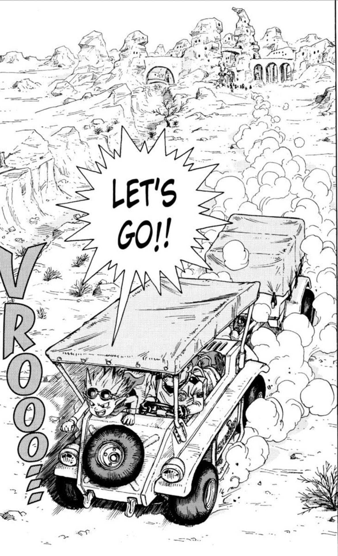
These techniques continue when the characters later arrive at the demon city. Toriyama draws a lot of detail and thicker lines in the foreground, decreasing both the detail and the line thickness the further away things are. This panel adds another element to the mix: a tight adherence to perspective. Perspective is one those techniques that really separates amateur art out from more refined works. I’ll probably some day write a longer piece specifically about the use of perspective in comics, but for now, it is enough to say that perspective is the visual phenomenon that occurs when two lines that appear to be parallel meet.
Look down the left and right side of a long straight road that continues on to the horizon and you’ll notice that the two lines appear to meet at a single point. Capturing this in art is another way to add realistic detail. This is most easily noticed in the line shadows under the arches. At the bottom, near the stairs, the lines appear essentially horizontal. But, looking further up the arches and the page, the lines start to slant diagonal. This is perspective, and once it is clear how that works, it can also be seen by looking at the lines of the roofs and the nearly vertical lines of the sides of the building.
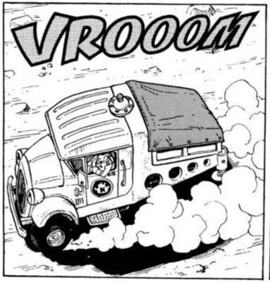
Toriyama doesn’t exclusively reserve detailed drawing, shading, and perspective for the background scenery. He was renowned for his drawings of vehicles, and understandably so. Drawing a car, even from reference, is difficult, but he could make it look easy. This first issue of Sandland has two cars, and they both display all of the techniques mentioned. Note how he’s even able to accurately capture the folds in taut fabrics and details of tires in motion.
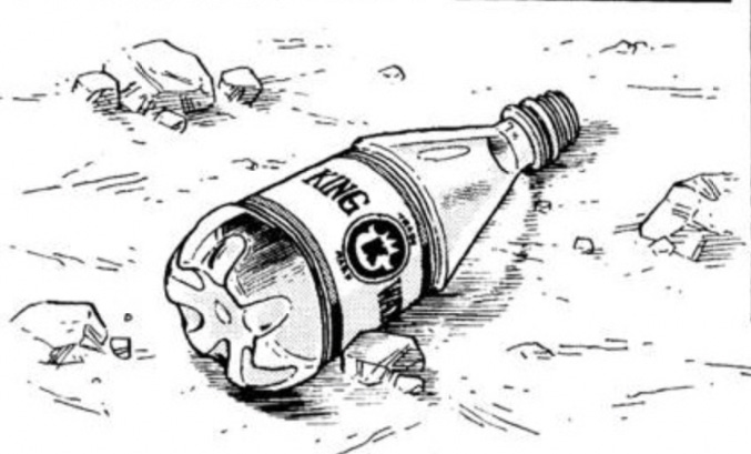
This all culminates in what I think is the best-drawn bottle of water in all of comics history. The complex curvature, the custom logo based off of the in-story water monopoly, and the difficulty of depicting a translucent object are no match for this literally tossed-off object. All of this is to say, the detail isn’t being drawn simply to impress. It is actually accomplishing something specific — making the setting feel more realistic. Even as the characters are drawn in the chibi cartoon-like style Toriyama pioneered, the place they are in always feels plausible. Toriyama knew that if the world that his characters lived in looked real, it would feel real too.
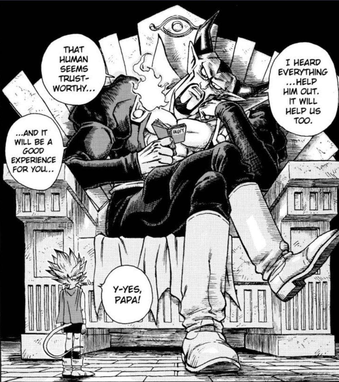
As previously mentioned, Toriyama is credited with developing the chibi style of drawing present in many manga and anime to this day. In perfect juxtaposition to the detail of his backgrounds, the chibi style works by creating simplified character designs. By keeping their appearances basic, Toriyama is able to caricature his leads to capture a wide range of expressiveness. This can be seen in all of his leads, from Dr. Slump’s Arale Norimaki to the child Goku design in Dragon Ball. In Sand Land, his protagonist is Beelzebub, the Prince of demons.

Toriyama is able to depict a wide range of expressions for Beelzebub. From happiness to anger, fear to loathing, and just a general intensity, Beelzebub has the kind of rubber face often seen in animation. It brings to mind the kind of faces one makes at a baby in order to keep their attention. The emotions are overdone and exaggerated, making their intent clear to any reader. Incidentally, this is probably the feature that led to Toriyama’s success in merchandising and licensing.
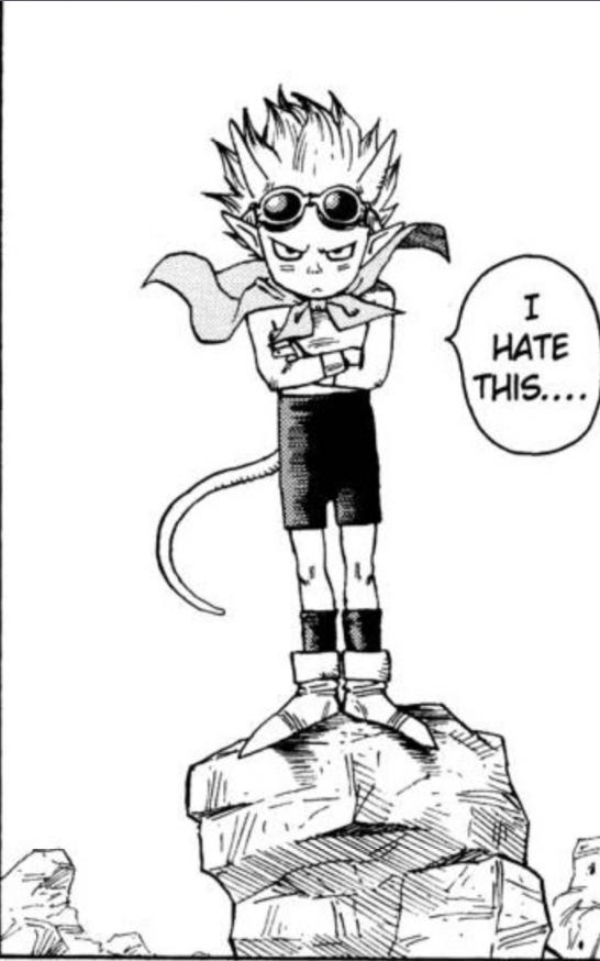
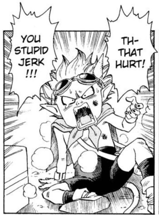
It’s that “relatability” element that makes Toriyama’s simply drawn lead characters shine. They tend to be open books, without the complications that create nuance. That’s reserved for the supporting characters. The leads are idealized and simple, so that the target demographic of this book, a child, can imagine themselves in that role.
Speaking of the supporting characters, let’s compare Beelzebub to Sheriff Rao. Immediately apparent is how different he is. There are many more lines, cross-hatches, and shading on a drawing of Rao. Even the clothes he wears are drawn in much more detail than Beelzebub. His range of expression is much more limited. Rao basically can only scowl and yell, his big mustache literally creating a firm upper lip.
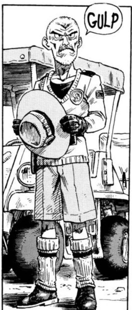
All of these details aren’t for nothing. Like the other major supporting character, Thief, Rao is not meant to be immediately relatable. He has a specific backstory that made him into the character he is today. A reader can definitely empathize with him, but would almost never say “that’s me, I’m Rao.” Whereas Beelzebub’s simplicity generates audience identification, Rao’s details create the appearance of depth and history.
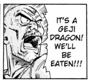
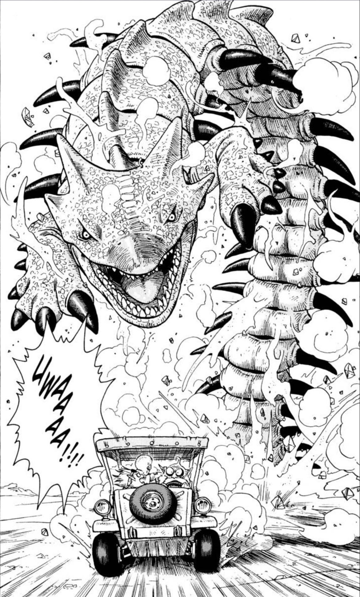
Finally, there are a couple of times where Toriyama pulls out all the stops. He draws giant figures that take up most of the page filled with an almost absurd level of detail. The first is portraying Beelzebub’s father, the king of demons, and the second is a giant dragon bursting out of the sand. The detail here is not simply done to impress readers with his artistic skill, as evident as it may be. Given that not every page is drawn with this much detail, Toriyama drew these pages this way for a reason. They draw the eye, sure, but they also convey something about the subjects. Their details demonstrate how powerful they are. Just as the detailed backgrounds convey a sense of realism to the setting, the impressive line work on these creatures conveys a realism to the threat.
By adjusting how detailed a given drawing was to match his needs, Toriyama was able to make better manga. Instead of sacrificing either realism or expressionism, he found a way to use both, depending on the needs of a given moment in a story. His mastery came from his ability to do this and make it look seamless. Next time you read manga or an American comic, pay attention to how much detail the artist is drawing and what they are accomplishing by it. Doing so will help you on your journey of Divining Comics.
If you haven’t already, consider supporting this work at ko-fi.com/spikestonehand. There, you can leave a tip or buy Zine versions of these articles. Doing this helps keep the website going. Follow me on Twitter, Instagram, and Bluesky.

Leave a comment