Void Rivals # 1 and Sound Effects
If you read any major publication’s articles on a comic book from the mid 1980s and on, there is a significant chance that the headline, subhead, or lede was a variant on “BIFF BANG POW, Comics aren’t just for kids anymore.” Aside from shoddy journalism, the prevalence of those noises demonstrate the importance of sound effects to comics. In a recent newsletter,1 professional Letterer Hassan Otsmane-Elhaou writes, “we use “sounds” in comics to draw attention to specific things,” which “implies that actually there are other sounds in a comic panel, we just aren’t specifically hearing them.” The magic trick of a comic book is showing you something visually that wouldn’t actually exist in physical space in order to communicate something to you beyond the mere literalism of a moment.
Sound effects are visual onomatopoeia used to create emphasis. A comic couldn’t possibly include every sound for logistical purposes, but they wouldn’t want to because not every sound is important. Again quoting Mr. Otsmane-Elhaou, “what a sound effect does in comics isn’t actually create a sound.” Rather, it “draws your attention to something and can help amplify a moment by making the readers actually “read” something.” Perhaps a subtle background moment is not highlighted by the drawing. A sound effect can help draw attention to it, like a vortex pulling in the reader’s eye with its gravitational force. Just as an exclamation mark reframes the words in a sentence, a sound effect reframes the visuals in a comic.
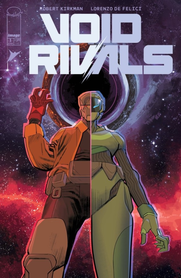
Sound effects are often (though not always) drawn in by the letterer. Like much of what a letterer does, they can often blend right in, helping readers parse a comic without drawing attention. I intend to draw attention to the artistry of the sound effect by looking at Void Rivals # 1, written by Robert Kirkman, drawn by Lorenzo De Felici, colored by Matheus Lopes, and lettered by Rus Wooten. Like much in comics, these sound effects could be collaborative. Perhaps they were suggested by Kirkman in the script and/or outlined in the rough sketches of De Felici. It’s possible that they were colored by Lopes in order to align with the look of the rest of his coloring. Most likely, the bulk of what makes these sound effects interesting to me is thanks to Wooton. Let’s look at some of the best examples from this issue to show some of what can make sound effects so cool.

Much of this is going to be a close-reading of the sound effects, and a lot can be gleaned by comparing how the same letter is rendered differently. This page has three sound effects, TLAK and VMMM twice. The TLAK is rendered in a more “naturalistic” hand. It could be someone’s natural handwriting, with what appear to be the minor imperfections that come from a human hand as opposed to a font.
That juxtaposes nicely with the VMMM. It is also not perfect machine lettering, maintaining an element of the organic. At the same time, the flat tops to the Ms suggest a hint of the technological, like the steps of a sound wave rendered in binary as opposed to the curve of analog. To put it succinctly, it looks like how an electronic hum sounds. That’s the magic of a well-done comic sound effect. And I love how the final M of panel three crosses into the fourth panel. That’s a simple way of letting you know that the sound is carrying on and doesn’t suddenly stop.

At the entrance of the surprise robot guest, the sound effects become even more robotic and machine-like. All of a sudden, there are no curves to the letters. Everything is a hard right angle, suggesting the artificially of the sounds. What is great about the lettering work here is how differently the same few letters look. Sometimes the H is wide and stout, and sometimes tall and thin.
Compare the sound effect to me writing out the same letters. CH-CHI-CHU-CHK-CHI. In my version, every letter and phoneme is given an equal weight. In the comic’s rendering, the letters are given different weights, which is presumably intended to vary the sound that you hear in your mind. A wide H is a longer lasting sound than a short one, and the extra-tall C to begin the sound effect implies the first noise is a bit louder than the rest. Even though these are letters and not what is traditionally considered the drawn part of comics, they are communicating information visually.

In order to best detail what these sound effects accomplish, I want to start with the second one, at the bottom of the page. It’s a humble VOOOSH. It accomplishes everything that it needs to in a simple manner, a basic unit of comic lettering. I’m sure if I wanted I could write more on what it is doing, but who would read that? For this example, it’s the normal element set up to be compared to the extraordinary.
Do I have to tell you what the extraordinary is? It’s obviously the giant SKRA KOOM at the top of the page. This lettering is huge, larger on the page than the actual explosion. We’ve already established that the size of the letters communicates certain things, like loudness. It also indicates the position of the sound in space. Our characters are the closest to the hypothetical camera, followed by the sound, and then the actual explosion. This makes intuitive sense, that the SKRA KOOM would come towards the characters from the explosion, but the layering of it helps our brains read it properly. Finally, the line here is a bit messy. Whether based off of font choice or if it was hand-lettered, the thickness of the line changes quite obviously, sometimes even in jagged ways. All of this enforces the effect of the explosion. It’a chaotic, loud event, so much so that even the lettering of the sound effects is affected.

I don’t know how much I can say about this THUNK, but it was my favorite sound effect in the book. It’s just so clean, while also achieving a certain distinctiveness. The straight, thin letters mimic the path of the projectile. Similarly, the extra-large U, being the only vowel sound, emphasizes the main element of the onomatopoeia. While the projectile is not an arrow, the sound of an arrow hitting a target is exactly what is brought to my mind. I just love this THUNK so much.
Finally, let’s compare some of the sounds it the fight scene. The contrast is made easy because some of the letters of the sound effects are repeated, but from a different source.
When the slightly more robotic and metallic character tackles the one with the jacket, the WRAMM sound effect has a lot of hard edges, minimizing the curves on the R and again using the topped off Ms from the first example at the beginning of this article. It is also shaped kind of like the action, with the WRA higher up and to the left, like the jacketed character, and the MMs lower and to the right, like the tackling robot. On the next page, the roles are reversed. The jacketed robot punches the other, again with a WRAMM. Though still very straight lined, this WRAMM is a bit more organic. The overall word is curved into an arc, with the W and last M lower than the central RAM. This mimics the impact of the punch, like if the letters themselves were hit.


These slightly different fonts for the sound effects are maintained through the fight. You can tell the source of the sound by how robotic the font looks. The jacketed character kicks the other with a WHUDD on the first page. Like the pattern would suggest, it’s more organic looking and arced to follow the path of the kick. On the second page, the all-metal robot hits the ground with a WHUDD. It’s the same letters, but with a cutoff W and a more metallic shape. The effect has the letters falling from left to right, matching the characters’ movement. Just a slightly different font choice or hand-lettering technique conveys large amounts of information on what the noise sounds like.
Sound effects are a magic trick distinct to comics. What would be a limitation of the medium, it’s inability to produce audio like a movie could, instead becomes an asset. So much information, much more than this article goes in to, can be conveyed by a sound effect. The next time you are reading a comic, pay extra attention to the sound effects that the artists included. That will help you better understand your journey in Divining Comics.
Consider supporting this work at ko-fi.com/spikestonehand. There, you can leave a tip or buy Zine versions of these articles. Doing this helps keep the website going.
- Hello Hass! Hope you enjoy this one. For everyone else, you can read these insights and more at https://buttondown.email/hassanoe/archive/the-lettering-list-008-sound-of-silence/ ↩︎


Leave a comment