20th Century Men # 1 and Time Travel via Style
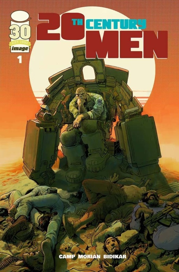
If you read a comic, where are you? Oftentimes we read comics in homes, at libraries, in schools, on public transit, and so many other locations. But one location you might not realize you are reading from is within the comic, in between the front and back covers. One of the deep magics of comics, like all kinds of art, is the power to transport you to other times and places. 20th Century Men # 1, by Deniz Camp, Stipan Morian, and Aditya Bidikar, takes its readers across time and space to an alternate earth of Soviet battle-suits and American super-soldiers using a plethora of artistic magics.
The issue begins taking the reader to Vietnam in 1969. You can tell because of the first simple trick, writing the location and date at the top-left corner. The reason many comics and movies do this is because it works. But, there are some other things going on with this page.

First, notice the color. This becomes especially obvious by comparison to the rest of the book. It is predominantly orange, with some reds and yellows. Hollywood has helped the comic mages here. So many Vietnam movies use this same orange hue, such that it helps the reader automatically feel like the setting is indeed Vietnam. It draws to mind the sunrise or sunset in the first panel, the warm tropical climate, the smoky color after a bombing, and perhaps even Agent Orange, the defoliant the United States dropped all over Vietnam, causing cancer and birth defects. It is also a color of heat, apt for the tropical humidity of southeast Asia. For all of these reasons, orange feels like Vietnam, and our transportation to 1969 Vietnam is aided by the orange tint.
The second element of the translocation spell is the style. Again, this stands out compared to the rest of the book. There aren’t many thick black lines. In fact, much of the drawing has a loose, brushy look. The second and third panels in particular are nearly impressionistic. This style reminds me of classic Americana, apt for the time period perhaps more than the location. It’s almost as if everything on page is melting, distorted by the heat. All of these elements work together to create a distinct and unique sense of setting.
This stable sense of setting is disrupted quickly. One turn of the page and the art feels radically different. Primarily, our sustained element is the date and location listed in the top left. Everything else could not be more different.
Gone are the oranges of Vietnam. Instead now we have black, white, and shades of gray bordering on sepia. Whereas the colors of the previous scene brought to mind warmth, here, we feel the cold of Russia. This also mirrors the story elements here, where a small child and his mother are tasked with making cold, emotionless decisions. These panels feel like they could be old photographs or perhaps even film reels, which is fitting considering they are set in the oldest time period in the book.

The style of drawing has also changed here. Instead of the loose paintings, here the art is strong lines. It is no longer impressionistic. It seems almost like every wrinkle and strand of hair are drawn, and shadows are cross-hatched. This increase in number of lines helps make the mostly colorless art less boring. It also matches the story. Quite literally, hard lines are drawn. Young Platonov must decide if he will give his entire life over to the Soviet cause.
And now, the synthesis of the two. The title in the top right informs us that we are once again in the USSR. Unlike before, it is 1969, the same year as the opening segment set in Vietnam. There is a certain logic that would suggest this setting would combine elements of 1969 Vietnam and 1948 Russia.

That logic is in this case correct, but not completely. Since the location is once again Russia, it follows that those two scenes would have the most similarity. In both, you have a strong pen line, with deep black shading and cross-hatching. Similarly, this scene is largely monochromatic, though the color has changed from black and white to black and green. More on that in a bit. Once again, this suggests a certain starkness to the environment. This isn’t a place of comfort.
However, it does sustain one element from the Vietnam sequence: the painterly color. This is especially visible in the background of the inset panels, which are a flowing green, and the crackling effect across the page. Unlike the warmth of orange, green feels kind of uncomfortable. It’s the color of vomit. Interestingly enough, given that green is the color of plants, it can also feel a bit unnatural or artificial, especially in a scientific scene like this one. There is a reason that Frankenstein and The Hulk are commonly green. The flowing colors enhance that feeling of unreality.
It is only after we explore these various settings that form the comic’s backstory that we arrive at our primary setting. The main action of the story happens in 1987, and much of it here, in Afghanistan. This setting stands out compared to the previous scenes in several ways.
First, we have a full color spectrum here, and things are more naturalistic. The sky is blue, the earth is brown, and the people are various fleshy colors. This feels comfortable, especially if you read comics often. The lines here too are present, but not as detailed as the Russia sequences. This is the closest the art gets to a traditional “house style” you’d find at one of the big comics publishers.

It’s important to note too that this isn’t the Afghanistan of the popular imagination. Yes, it is a desert, and many of the residents are notably Muslim because of their garb. But the feelings this scene evokes are comfort, home, and normalcy. One of the book’s protagonists, Azra, is standing in front of some green plants, and the middle panel is framed by trees. After the oppressive heat of Vietnam and the brutal cold of Russia, Afghanistan feels like an oasis. Without spoiling the rest of the series, this is fitting. Part of the speculative alternate history of this premise is to show what an Afghanistan that was allowed to flourish for itself, instead of being the pawn and battle ground of various great powers, could achieve, in an admittedly science-fictional world. All of this is foreshadowed by style of this setting.
The setting of a story is much more than mere set-dressing. It can convey emotion, tone, and mirror the themes. A skilled comics mage can walk the balance of maintaining a consistent style while also changing things up to cause an effect in the reader. What is more magical than making you feel something? Paying attention to the details of a setting can help you in your continued journey of Divining Comics.


Leave a comment