The Ribbon Queen # 1 and Creating Character Through Facial Expressions
How do you get to know a person? In real life, you spend time with them. Seeing how they react to different situations, what they say and do, and why they make decisions lets you know who the person is. All of these things form the gestalt of our personalities.
Comic books, on the other hand, aren’t people. They’re pieces of paper or digital files made of lines and colors. The magic of comics is that somehow these markings can be characters, and convey emotions to the reader. It’s the same magic that transforms a colon and an open parenthesis into a smiley face : ) . Though they are inert objects, life can seemingly inhabit comics, like a golem or homunculus.
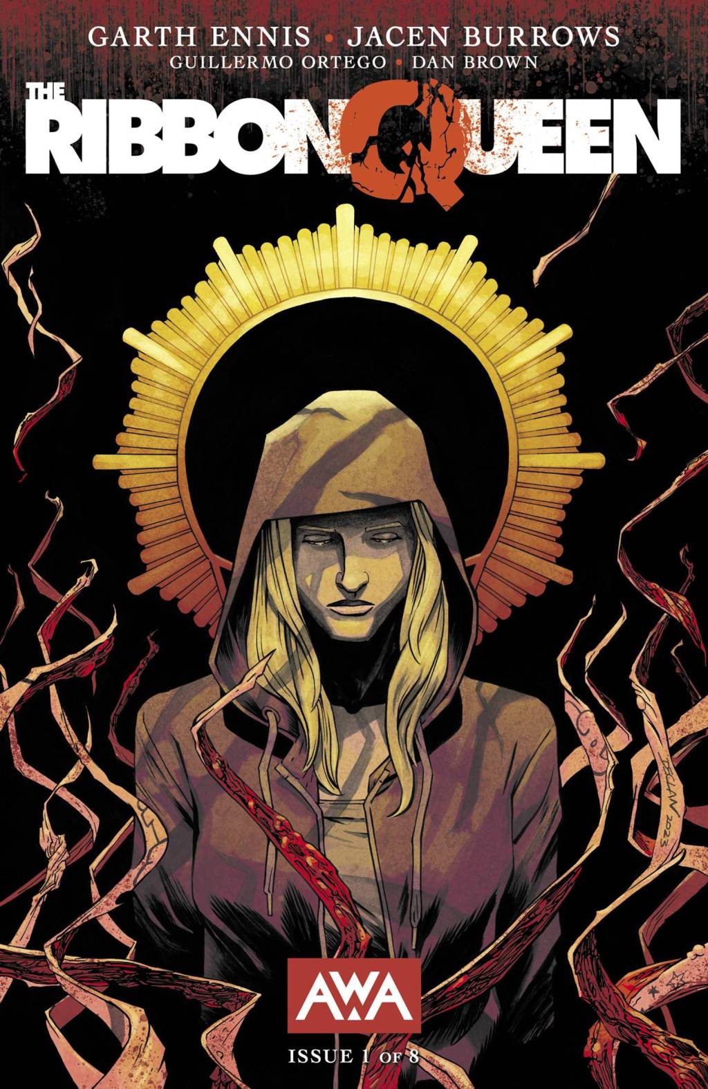
One comic that pulls off this magic trick well is The Ribbon Queen # 1, written by Garth Ennis, drawn by Jacen Burrows, inked by Guillermo Ortego, colored by Dan Brown, and lettered by Rob Steen. I’ll examine two characters in particular, the police chief and the crooked cop, though it would work with any of the characters in this issue. So as to keep focus on the facial expressions, body language, and angle of shot, I removed the words from all of the word balloons.

The police chief is a bit of a stock character in media. That trope is in full effect here. It isn’t hard to tell that this character is angry. But how does the artist conjure up that emotion?
The first thing to note is that the angry images are at a particular angle. If this was a movie, the camera would be placed below eye level, looking up at the chief. That makes him physically imposing. His features become slightly stretched and exaggerated, emphasizing their emotion.


Now look more close at those features. Mouth open, in the middle of likely shouting something. Forehead lines1 furrowed and lower, closer to the eyes. Eye brows tilted inwards. The classic angry face. But, this magician’s spell loses its potency with use. These three panels are the only times the chief is drawn this angrily, over the course of a conversation. By using these tricks sparingly, the art team is able to emphasize particular moments. The police chief, contrary to stereotype, isn’t always angry. But he can be.

One of the most common types of facial framing, panel, or shot, is the medium-to-wide. The artist draws the focal character from a distance, depicting some of their face, but also body language and background. Here, details about the police chief’s character are communicated to us through his desk and wall. There are plenty of papers clipped together. He’s active and busy, but not disorganized.
The wall is decorated with what seems to be awards or pictures with important people. The room has filing cabinets and an American flag. Here, the comic book creators are adding the illusion of realism. These details are perfectly in the ordinary for a police chief. But through the magic of comics, including these details wells up the feeling of correctness and rightness in the reader. Everything is as it should be.


The medium panel also allows for the depiction of facial expression and body language. While a close-up is for pure emotion, the medium adds a bit of posture to things. The surprise drawn in the police chief’s face is matched by moving his head away and tilting the chin up, as if he is literally taken aback.


It also allows for the artist to have two things in frame, a setup-punchline of subject and reaction. Here is our protagonist, or her phone, and here is the chief’s reaction. It’s even drawn left-to-right, aligning with the flow of words on the page in English and many western languages.

When the artist draws the police chief in close-up, they are able to communicate to the reader complex emotions. In real life and in comics, emotions are depicted through subtle changes in the face. Here the artist gives the police chief a furrowed brow, closes their eyes, and turns their head slightly down. His lips are slightly upturned, and his mouth open wide enough that the gap between the top and bottom rows of his teeth is visible. Anyone reading this can see the police chief is frustrated.

That anger, with a few subtle tweaks, turns into a more tired ire. Here, the chief’s eyes are still closed and his forehead wrinkled. Now, his lips have relaxed, and his mouth shut slightly. His hands are rubbing his temples, a physical demonstration of the headache he is feeling. This is key. As a reader, I cannot tell if the fictional character has a headache, because the fictional character isn’t real. One unsubtle and inelegant way to let me know is if, in the dialogue, a character states “I have a headache.” However, because pain is an internal sensation, depicting it nonverbally in comics requires an outward manifestation.

This depiction of emotion works so well, the comic magician can create it out of nothing more than a well-place hand. They don’t drawn any of the police chief’s facial features here. The only clue as to how he is feeling is that his hand is covering his face. But, for even the least observant of readers, the exact feeling the police chief is feeling is immediately obvious.
The other main supporting character in this issue is the awful cop. The first time the awful cop is introduced to the reader, he is shown via a cell phone video. This is a very powerful and subtle way, before his expressions are even observed, of detailing his character. It creates a distancing effect, as he isn’t “really” there. To be fair, none of the characters are. This is a comic book. But he is even less not there because he is only present via simulated video. This also calls to mind real-life atrocities carried out by American police. In the past, if police brutality towards someone like Rodney King was captured on video, it was displayed on a television. But, in the present, these evil acts are taken and shared on cell phones. Without even depicting racial violence, it calls to mind George Floyd, Eric Garner, Oscar Grant, and far too many others.


That monstrous policing is reinforced by how the awful cop is drawn. First, he physically dominates, taking up much of the phone’s screen and pushing other characters outside of the phone screen’s borders. This is a recurring theme in his drawings. Second is the angle. The now more literal camera lens is at table or waist height, looking up at the awful cop. This adds to his dominating effect. Finally, look at his face. Later, the awful cop will be drawn with some actual facial features. Here, he’s drawn like a meathead, like every bully in an ’80s movie. He looks kind of upset, but he mostly looks like a goon, or perhaps the Terminator.

Later, when the protagonist runs into the awful cop in person, things are totally different. Here, he is fully and completely relaxed, even though he is in someone else’s home. Though he can and will be physically imposing, here his scariness comes from how at ease he seems. His facial expression is casual, he is dressed for comfort, and his arms are spread wide. I don’t know how the awful cop could be more comfortable unless he was wearing pyjamas.

Now look at the perspective lines, here in yellow. To conjure the illusion of depth, artists can use various perspective techniques. Lines that should be parallel to each other, like the ceiling and floor edges, or the sides of a coffee table, point to a single vanishing point. This makes objectively flat paper look like a three-dimensional diorama. But, the vanishing point can also draw the eye. Imagine each of the lines drawn were instead arrows, all pointing to the same thing. Here, that is the head of the awful cop. He is the center of attention, and he knows it.


When the awful cop stands up, his size once again dominates. Like in the cell-phone footage, the reader is looking up at him, and he takes up most of the frame. However, instead of his drunken, gooner face, the awful cop is now smug. He smiles without showing his teeth. He chuckles to himself. He literally looks down his nose at the protagonist and at the reader. And when the panel frame stretches, looking like a widescreen film, his face is literally too big to fit.

This hits its apotheosis in the awful cop walking out of the apartment. Look at how much bigger he is drawn than the protagonist. His silhouette literally engulfs hers completely. He could not be more physically threatening than he is in this moment. And once again, the awful cop is drawn with a knowing smirk. He is aware of the threat he poses, and is using it to his advantage.
These are two characters drawn by a true wizard of comics. So much of what is happening in a scene is clear to the reader from the drawing only. This frees up the dialogue to be more interesting, communicating details, character, and simply being fun to read. That freedom comes from the tightness of emotional expression and framing that the artist creates. Through a mastery of line, the artist psychically communicates to the readers exactly what emotions are moving throughout a scene, like a master actor. Understanding this is one more step on your journey of divining comics.
- Cartoonist secret technique: the more lines drawn on a person’s face, the older they seem to the reader. ↩︎

Leave a comment